We’ll learn about building a webpage by following every step of the process for the second Website Project. The final page should look similar to this:
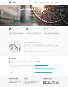
Step 1: Breaking the design into boxes
We’ll start by breaking down the major sections in the website. These are typically easy to spot as they are visually separated. Here is the breakdown:

At this point we can safely add each section to our web page as a div which has the class of the named section like this:
<div class="header">

</div>
Or we can continue to break down each section into smaller boxes. I’ll go through each section and how to break it down. Let’s start with the header

The header has two columns, one that appears on the left and houses the logo, and one that is on the right and has our navigation.
Important: To create columns you need a parent
In this situation, we want two columns in the header, meaning that we’ll need to have only two direct children inside the element. This is already going to be the case as long as we’ve created a div.header and added inside two elements, the img.logo and div.menu. However, in other situations, there may be a third element that should remain on a separate row. For example:

In this situation, if we simply added the 3 elements inside the parent we would get 3 columns if we applied flex to the parent. To resolve this we’ll need to add an additional element that wraps the image on the left and the title on the right. This new element is the immediate parent of the two children that should appear as columns.

<div class="main-parent">
    <img src="image.png">
    <div class="title">Title</div>
    <div class="description">
        Description Here
    </div>
</div>

<!-- SHOULD NOW BE -->

<div class="main-parent">
    <div class="flex-parent">
        <img src="image.png">
        <div class="title">Title</div>
    </div>
    <div class="description">
        Description Here
    </div>
</div>
As you can see the before only has 3 immediate children inside the .main-parent which are img, div.title, and div.description. In the second piece of code .flex-parent has only two direct children img and .title meaning that they will be the only two items appearing next to each other.
Back to the header
Okay let’s resume with the header
There are two direct children of .header
<div class="header">
    <img src="logo.png">
    <div class="menu">
        <a href="#" class="menu-item">
            Home
        </a>
        <a href="#" class="menu-item">
            Features
        </a>
        <a href="#" class="menu-item">
            ...
        </a>
    </div>
</div>
The img and the .menu. Inside the menu box, we simply add our links with a class .menu-item. We’ll need the classes on the anchors because that’s the only way to change their color from the default blue later on.
Next, we break down the hero

Inside the .hero box, we only have 3 elements (no columns). The big title becomes .main-title and then the text below .main-description and finally the button .main-button

The sub-points section has 3 columns, meaning we need 3 immediate children called .sub-point-column. Inside each, we’ll need two rows, the .sub-point-header which will contain the img and the .sub-point-title allowing them to display as columns when flex is applied, and the .sub-point-description for the paragraph of text.

The communicate section has two columns, the first is the img on the left, the second is the wrapper called .communicate-right-column because if we had the title and description without a wrapper they would both appear as columns, instead we want them to appear as rows and we add the parent wrapper to house .communicate-title and .communicate-description.

The about section is probably the most difficult one. The first part is realizing that the top title “ABOUT SIMPLA” is an element on its own called .about-title row followed by another element .about-columns which is needed to make its children into flex columns.
Inside the .about-columns we have two immediate children .about-left and .about-right. Inside the left column, we’ll also need a header element called .about-left-header which will be flexed to have two immediate children which are columns. An img and a .about-left-title will be directly inside the header box. After that, we add the description box .about-left-description and with that, the left side is done.
In the right column we need the special title .about-right-title then for each skill, we’ll add a new box .about-right-skill. Which contains two immediate children .about-skill-header and img (which contains the percent indicator in blue). Inside the .about-skill-header (which is not written in the image example as there is no space) we have two children, .about-skill-title which should appear on the left as a column (meaning .about-skill-header is flexed) and .about-skill-percent which is the right column containing the number of percents.

The footer is quite straightforward. We have 3 immediate children which will be columns named .footer-column. Inside the first two we add a .footer-title and a .footer-description. In the last column instead of a description, we add a .footer-gallery to allow its immediate children img to display as columns.
Step 2: Adding the boxes as HTML
Now let’s convert each section into HTML code
<div class="header">
    <div class="logo">
        <img src="https://ucsbwebdev.fzilla.com/sites/second/logo.png">
    </div>
    <div class="menu">
        <a href="#" class="menu-item">
            Home
        </a>
        <a href="#" class="menu-item">
            Features
        </a>
        <a href="#" class="menu-item">
            Portfolio
        </a>
    </div>
</div>
<div class="hero">
    <div class="main-title">
        Welcome
    </div>
    <div class="main-description">
        WElcome to my call to action
    </div>
    <a href="#" class="main-button">
        Learn More
    </a>
</div>
<div class="sub-points">
    <div class="sub-point-column">
        <div class="sub-point-header">
            <img src="https://ucsbwebdev.fzilla.com/sites/second/bullet1.png">
            <div class="sub-point-title">
                Understand the project!
            </div>
        </div>
        <div class="sub-point-description">
            IJjisd iasjd aiosjd oisaj doiasjd iosaj dioasjd oiasjd oiasjd oiasj dioasjd ioasjd ioasjd
        </div>
    </div>
    <div class="sub-point-column">
        <div class="sub-point-header">
            <img src="https://ucsbwebdev.fzilla.com/sites/second/bullet1.png">
            <div class="sub-point-title">
                Understand the project!
            </div>
        </div>
        <div class="sub-point-description">
            IJjisd iasjd aiosjd oisaj doiasjd iosaj dioasjd oiasjd oiasjd oiasj dioasjd ioasjd ioasjd
        </div>
    </div>
    <div class="sub-point-column">
        <div class="sub-point-header">
            <img src="https://ucsbwebdev.fzilla.com/sites/second/bullet1.png">
            <div class="sub-point-title">
                Understand the project!
            </div>
        </div>
        <div class="sub-point-description">
            IJjisd iasjd aiosjd oisaj doiasjd iosaj dioasjd oiasjd oiasjd oiasj dioasjd ioasjd ioasjd
        </div>
    </div>
</div>
<div class="communicate">
    <img src="https://ucsbwebdev.fzilla.com/sites/second/idea-image.png">
    <div class="communicate-right-column">
        <div class="communicate-title">
            Communicate your idea
        </div>
        <div class="communicate-description">
            jsadioas jdojas dij asjasdoij asoidj asiodj asd
            asdij asoidj aisodj aiosdj ioasd ioasjdas
            dasjiod ioasjd ioasjd ioajs d
        </div>
    </div>
</div>
<div class="about">
    <div class="about-title">
        Title of about
    </div>
    <div class="about-columns">
        <div class="about-left">
            <div class="about-left-header">
                <img src="https://ucsbwebdev.fzilla.com/sites/second/about-title-image.png">
                <div class="about-left-title">
                    Title of left col
                </div>
            </div>
            <div class="about-left-description">
                ijsadoj asidoja sdioj asiod jasiod jaiosd ioas disad
            </div>
        </div>
        <div class="about-right">
            <div class="about-right-title">
                Our Skills
            </div>
            <div class="about-right-skill">
                <div class="about-skill-header">
                    <div class="about-skill-title">
                        WORD PRESS
                    </div>
                    <div class="about-skill-percent">
                        65%
                    </div>
                </div>
                <img src="https://ucsbwebdev.fzilla.com/sites/second/skills-1.png">
            </div>
            <div class="about-right-skill">
                <div class="about-skill-header">
                    <div class="about-skill-title">
                        WORD PRESS
                    </div>
                    <div class="about-skill-percent">
                        65%
                    </div>
                </div>
                <img src="https://ucsbwebdev.fzilla.com/sites/second/skills-2.png">
            </div>
            <div class="about-right-skill">
                <div class="about-skill-header">
                    <div class="about-skill-title">
                        WORD PRESS
                    </div>
                    <div class="about-skill-percent">
                        65%
                    </div>
                </div>
                <img src="https://ucsbwebdev.fzilla.com/sites/second/skills-3.png">
            </div>
        </div>
    </div>
</div>
<div class="footer">
    <div class="footer-column">
        <div class="footer-title">
            Title
        </div>
        <div class="footer-description">
            Description
        </div>
    </div>
    <div class="footer-column">
        <div class="footer-title">
            Title
        </div>
        <div class="footer-description">
            Description
        </div>
    </div>
    <div class="footer-column">
        <div class="footer-title">
            Title
        </div>
        <div class="footer-gallery">
            <img src="https://ucsbwebdev.fzilla.com/sites/second/footer-1.png">
            <img src="https://ucsbwebdev.fzilla.com/sites/second/footer-2.png">
            <img src="https://ucsbwebdev.fzilla.com/sites/second/footer-3.png">
            <img src="https://ucsbwebdev.fzilla.com/sites/second/footer-4.png">
        </div>
    </div>
</div>
Step 3: Making columns appear
To make each box that has columns work we need to apply display: flex;
To save time, and make it easier to work with, we’ll create one single class called flex which we can add to all parents that have columns. So in our style declaration, we add
.flex {
    display: flex;
}
Then for each element like the header we add the class flex by adding a space after the initial class like this
<div class="header flex">
The following elements should have the flex class added
- header
- menu
- communicate
- sub-points
- sub-point-header
- about-columns
- about-left-header
- about-skill-header
- footer
- footer-gallery
In some situations, like the .header we want the columns to have space between them and display on each side. To do this we use a flex property called justify-content with value space-between to look like this
.header {
    justify-content: space-between;
}
We should add this style declaration to the following classes
- header
- menu
- communicate
- sub-points
- about-columns
- about-skill-header
- footer
- footer-gallery
Your stylesheet should look something like this
.header {
    justify-content: space-between;
}
.menu {
    justify-content: space-between;
}
.communicate {
    justify-content: space-between;
}
.sub-points {
    justify-content: space-between;
}
.about-columns {
    justify-content: space-between;
}
.about-skill-header {
    justify-content: space-between;
}
.footer {
    justify-content: space-between;
}
.footer-gallery {
    justify-content: space-between;
}
In some situations, we need to have the columns align vertically to be centred like in the .sub-point-header where the image needs to be exactly on the same level as the .sub-point-title. To do this we use another flex property called align-items with value center like this
.sub-point-header {
    align-items: center;
}
Apply it to the following
- sub-point-header
- about-left-header
- about-skill-header
Step 4: Adding images
To add all the images needed please use the following link https://www.dropbox.com/s/yzzwaswuhlimjgp/colors-and-links.txt?dl=0
Step 5: Adding styling
To finalize the website we need to add some styling. Let’s start with the header.
In the header the menu items are links which appear blue and underlined. To adjust this we have to override the browsers default styling for an anchor by specifying a style declaration which targets the links, in our case we used the class .menu-item
So we need a style like this
.menu-item {
    color: #787878;
    text-decoration: none;
}
The color declaration change sit from blue to dark gray, and the text-decoration will remove the underline. Now to make these items spaced nicely and increase the clickable area so it’s easier to click we need to first change the anchor from an inline element (used when shown amongst other text) to an inline-block element which gives it ability to distance itself in any way we see fit. Should now look like this
.menu-item {
    color: #787878;
    text-decoration: none;
    display: inline-block;
    padding: 20px;
}
I also added some padding which adds spacing inside the element.
Inside the hero we need to make the text of the title big, white, and bold. To do this we’ll use the same color property as above and we need font-size alongside font-weight which we set to bold.
.main-title {
    font-size: 100px;
    font-weight: bold;
    color:white;
}
We’ll probably also want to add some distance underneath it, to do this we use margin which pushes away from the outside. So to push below we do
.main-title {
    font-size: 100px;
    font-weight: bold;
    color:white;
    margin-bottom: 20px;
}
Notice we added margin-bottom which only changes the bottom push.
We’ll also want to make all text inside the hero centred and add the hero background image. For this we use text-align and then set a background with the url(); value
.hero {
    text-align: center;
    background: url(https://ucsbwebdev.fzilla.com/sites/second/hero.png);
}
Do the same color change as we did for the .main-title to the .main-description and also apply similar styling to the .main-button as we did to the .menu-item buttons. One additional thing we’ll add is a white border which is done with border: 1px solid white;
Using the same color, font-size, margin-bottom, and font-weight add more styling to make the website look closer to the final product.
In the footer we can add a border to the .footer-title only on the bottom just like this
.footer-title {
    border-bottom: 2px solid #ccc;
    font-size: 20px;
    font-weight: bold;
    margin-bottom: 15px;
}
After you’ve played around let me know and i’ll assist you with getting it finalized!


